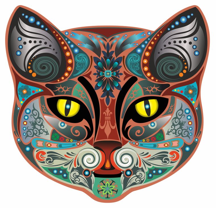
You like your bottle of wine to be sleek, seductive and stately. One could use the same descriptors for a cat. It is surprising why our cats are not mascots of this glorious beverage considered the intellectual part of a meal. But a new brand of wine called Early Dark—from the Bengaluru-based Tetrad Global Beverages, in collaboration with Vignobles Arbeau from France—is coming out with the purr-fect label on its bottle—the face of a cat in all its colourful, geometric glory. Launched in February by Abhay Kewadkar, the managing director of Tetrad, Early Dark’s Macavity-like creature is mysteriously patterned. It looks like the elaborate face of a South Asian truck studded with light-bulbs, or an intricate trump card with neon eyes.
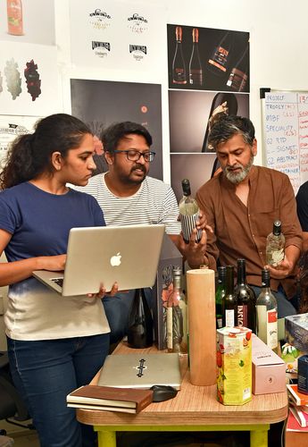
This label art is all about cat-titude. “After all, Early Dark is more than just wine. It is that golden sliver of time when light gives way to dark. When jackets and inhibitions vanish and our feline appetite for fun surfaces. Perfect for a brand that aims to be fun and lively rather than stuffy,” says Mohan Vijaya Raghavan, who did the artwork for the label. “We used fading typefaces to reflect the fading hues of the sky during twilight or early dark. The face or symbol of the brand—a feline—came equally naturally. Early dark is when the big cats set out to prowl and hunt.”
How often have you been drawn to wine label art as a determinant for buying a bottle? As an amateur wine enthusiast, do you look for names of the producer, terroir, kind of grape and year of birth in elegant, old-school lettering, against a backdrop of chateaux or vineyard images? How appalling would it be to have punkish, unconventional designs and imagery on the body of “the most civilised thing in the world”? These are questions that surface at a time when the bottled crafts beer segment is bubbling with playful, animal-centric labels—of white rhinos, owls, monkeys, bulldogs, lions and lizards. Internationally, a quick perusal of Pinterest will throw up a smorgasbord of award-winning, quirky and inventive wine-packaging—featuring everything from foxes to octopuses to a boarding pass to mugshots of former convicts to polka dots and crazy hair-dos. Now, has wine label art evolved in India?
Grover Zampa, India’s oldest, most premium and second-largest wine producer, is busy executing some “millenial makeover” moves. It will soon start offering wine in a can, is venturing into hospitality like Sula and Fratelli, and will launch a line of skin care products and cosmetics made out of Grover grapes. It is also developing a new range of wine targeted at working individuals above 26. “The design on the label will be very modern, but not exactly ‘funky’,” says Sumit Jaiswal, associate vice president (marketing and exim) at Grover Zampa. The new range should be ready by December and the label work is being handled by Pune-based Lemon Design, Grover Zampa’s long-time collaborator. “The boundary between black and white in our society is blurring,” says Dipendra S. Baoni, founder and managing director of Lemon Design. “Divisions born out of race, caste, religion and gender are no longer tenable. The resultant interplay is the celebration of diversity as reflected in various art forms like theatre, dance and painting. The new Grover collection reflects this coexistence of black and white for the xennials and millennials today.”
Grover Zampa’s label art has had an interesting trajectory, especially in their association with modern artists. Its 2007 line called the Art Collection commissioned eminent Indian painters to design the labels. Hence, Jatin Das designed the Blanc de Blancs label; Paresh Maity, the Shiraz and Viogniers; Sanjay Bhattacharya, the Cabernet Shiraz and Chenin Blanc; Rini Dhumal, the Sauvignon Blanc; and Rekha Rodwittiya, the Shiraz Rosé. For its Santé range of wines—priced between Rs400 and Rs550—it collaborated with Goa’s famous cartoonist Mario Miranda to lend a more fun, casual touch to its labels. Grover Zampa’s Vijay Amritraj Reserve Collection had the tennis star’s visage on the labels.
But the company does not want to let go of tradition, especially in their premium range of wines meant for aficionados and collectors. These HNI wines use high quality paper for the labels, which denote all the serious qualities of a wine. “It cannot be a Mario Miranda artwork for a 06,000 bottle,” says Jaiswal. Also, almost 70 per cent of the back label is taken up by information that the FSSAI mandates must be on it. This leaves very little space for aesthetically expansive design, he says.
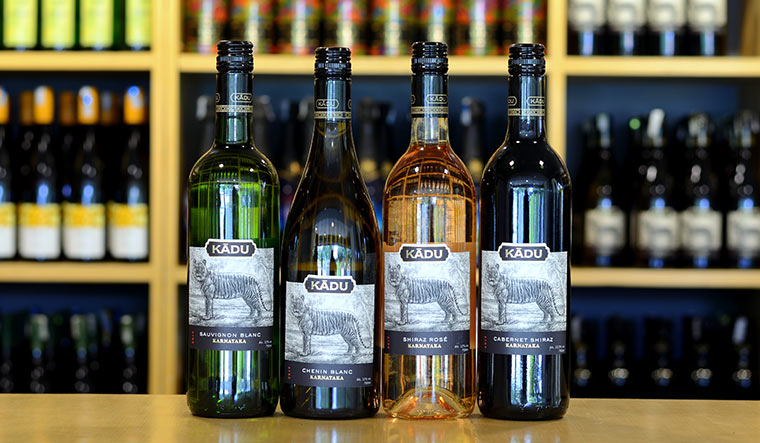
Ever since the company launched twenty years ago, Sula is known for the sun symbol on its bottles. It symbolises the climate of its vineyards. The brand is named after founder and CEO Rajeev Samant’s mother. They recently launched an interesting label for Kādu, the first premium wine offering from Sula’s Karnataka vineyards. Kādu means ‘wild’ in Kannada. It is India’s first ‘Wine for a Cause’. The proceeds from each bottle will contribute towards tiger conservation in Karnataka. The art is the handiwork of renowned label designer Simon Frouws, and it depicts a tiger in all its glory in the wild.
Jaiswal from Grover Zampa admits that innovative labels are not the only factor dictating sales. But he says that they have received positive feedback on how the flagship brand has been redesigned. “Customers have commented on the premiumness of the label, which has led not only to a spike in cost but also a surge in sales over the years,” he says.
Sommelier, author and columnist Magandeep Singh is, however, not too convinced. “While wine can be friendly, the way to do that is by making people understand the beverage; you cannot do that by making it look silly,” he says. “Something like wine speaks with authority and history and you have to respect that. You can’t play into a lack of education for standing out on the retail shelf.” Among younger wine brands, he prefers Krsma, J’noon and York for their taste, look and feel. “But when you go for something prestigious and premium, it is still classic, old-school, golds and blacks and reds, dark heavy bottles,” he says.
Grover Zampa had a line for first-time wine drinkers called One Tree Hill. It sought to look friendly and instructional by bringing to the front of the label information usually found at the back—in witty, vibrant lines and typefaces. This design strategy might not work in today’s information-saturated market. As Baoni says, “Education is fine. But it should also be about inclusion and first impressions.”


